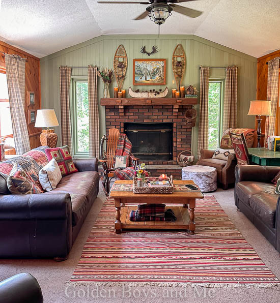
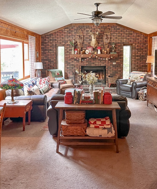
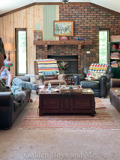
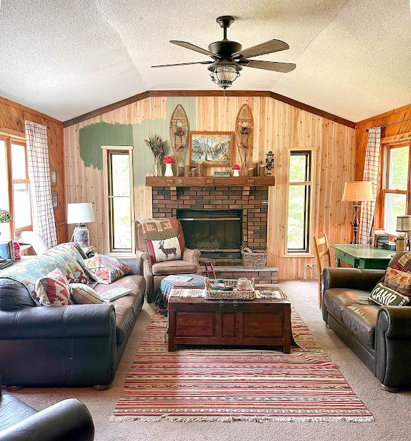
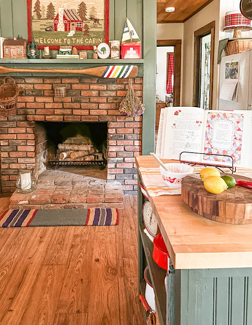
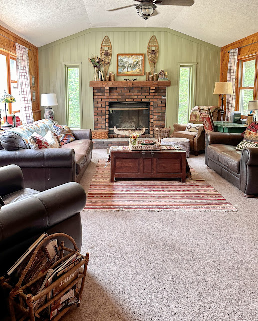
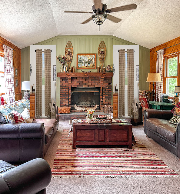
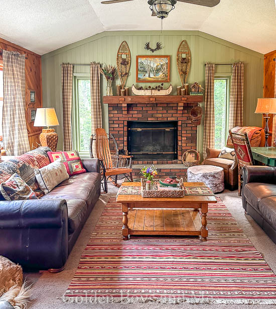
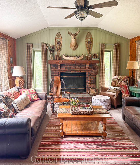
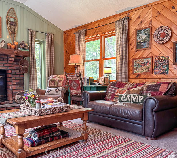
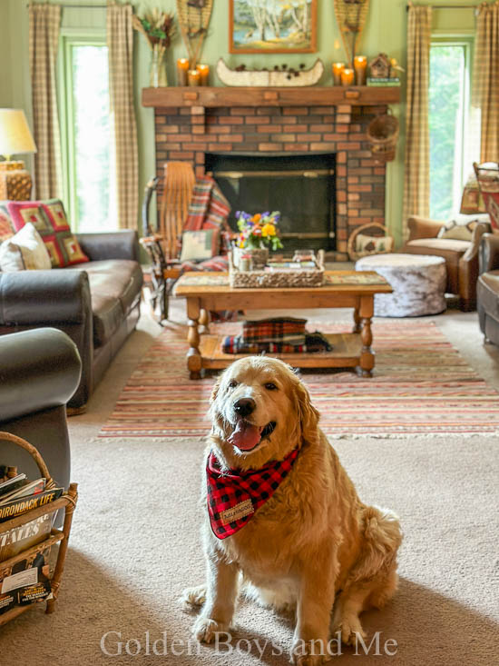
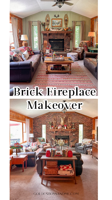
We also lived with a few Farrow and Ball samples of paint, checking out the lighting different times of day. That is Calke Green on the left and Lichen on the right. We also sampled Verte de Terre (as you can see in the upper pic) which I thought was my first choice but ended up being too light and leaned more blue in our space. Especially with Farrow and Ball, samples in the actual space have become an important step. After much debate and voting, we landed on Lichen. We used tongue and groove paneling purchased at Home Depot for this project. As soon as the paneling was up we were really pleased with how it helped fix the proportion of the size of the firebox. This fireplace now mimics the original fireplace that is in the kitchen and was built when the cabin was. The bricks in the family room don't have that lovely patina that the original ones do but they do still lend a rustic vibe so I'm glad that we kept some of the brick as this is a cabin in the woods after all. The fireplace in the kitchen is painted Backwoods by Benjamin Moore.I love how the lichen lends so much vibrancy to the space and is reminiscent of the leaves just outside the windows. It reflects the light in such a pretty way too. But after we finished painting, the windows still felt a little lost to me and I started brainstorming how I could change that. And so I added some curtain panels using the very rudimentary Photoshop I have and I liked the proportions so much better! I reached out to my friends and VHC Brands and they were happy to collaborate on helping is finish up this space. The curtain panels are Sawyer Miller Charcoal plaid.
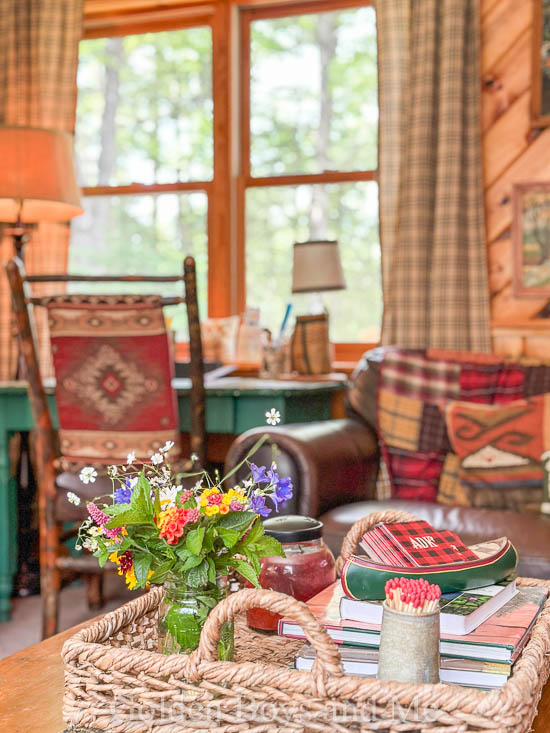
They also sent us some throw pillows in their tea cabin design and I used throws that I already had on hand to complete the look.
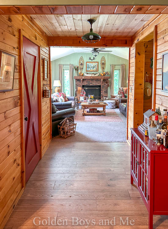
This cabin has been in my husband's family for many years before we purchased it from them 3 years ago and so I always try to remain cognizant of everyone's memories and preferences. There has been a taxidermy deer hanging over the fireplace forever and while none of us are hunters, it has become a mascot that everyone calls Jim. And so we did add a screw to return Jim to his rightful home and I do like that I can now also change him out for a paint-by-numbers that is more my style some of the time. We still have plans to add wood planking to the ceiling and to add the same wood flooring that is on the rest of the main floor to this space as well. But, we are taking a break to enjoy the rest of the summer and will continue more in the fall.Thanks for stopping by!
Very nice! Everything now stands out, including the fireplace itself. Love the change!
ReplyDelete
ReplyDeletelove it!! (all) as usual!!
Angela from NJ (down the shore but always wanted a cabin in the woods!!!)
Love the changes, it looks amazing. The color really brightens up the room. That shot thru the hallway is beautiful. I really like the new curtains too, helps make the windows look wider. My favorite part of your post was that you’re not hunters ❤️❤️❤️❤️. Pretty sure I would never leave your cabin, it’s perfect.
ReplyDeleteI love it! Enjoy the rest of your summer and thanks for sharing. Your blog and social media inspires me much more than most because it’s beautiful and on a realistic budget with affordable materials.
ReplyDeleteLove the transformation. The room looks so cozy and inviting.
ReplyDeleteOh Courtney it looks beautiful, perfectly done!
ReplyDeleteLooks fabulous. Have a great new week. Hugs. Kris
ReplyDeleteWhat a transformation!
ReplyDeleteGreat solution! Love it👍🏻
ReplyDeleteVery nice; I like the painted beadboard. It balances the whole room.
ReplyDeleteIts a world of difference,,it looks sooooogoooood.you did a beautiful job,,donut
ReplyDeleteYour fireplace wall looks terrific! It brightens the entire room. Love the shade of green you chose.
ReplyDelete