Today, I am finally sharing how I made the "Baking Co" sign that hangs in our dining area. I always hesitate to write posts like this because I am not an expert at sign painting by any means. As you will see, when I do projects like this, I come up with the idea and then sort of wing it through trial and error. I am going to share the good and bad of this project. More importantly, I am sharing both my thought process and the actual steps we took so you can create your own sign that has meaning to you.
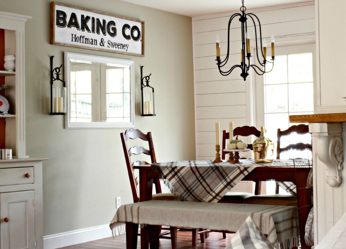
Recently, we decided to add more of a farmhouse vibe to our dining area with wall planking. Then, because I can never leave well enough alone, I wanted to take it a step further with a farmhouse style sign. I have been seeing lots of large black and white signs popping up on blogs and Instagram and I figured I could make one for a lot less than purchasing one. First, I decided what I wanted the sign to say. I chose Baking Co. because I love to bake and the Hoffman & Sweeney remind us of one of our favorite places in the mountains. I created the graphic in Picmonkey, saved the image, uploaded it to Blockposters and created a large poster print out of what I wanted the sign to look like to create a template.
Step 2: Creating the Board From Template
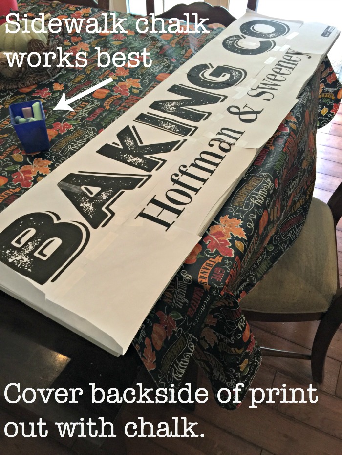
I then hung the template on the wall to see if I was satisfied with the size. The first one I printed was smaller and you can see that one on the table in the picture above. I decided the smaller one wasn't giving me the graphic black and white "punch" I was looking to add with this sign so I created a bigger one in Blockposters and I was finally happy. I handed the template over to Billy at this point. Billy took it and cut a large piece of plywood he had leftover from another project into the size that I had created (ours is 54"x16"). If I didn't have Billy to do the cutting, I would have purchased a pre-cut board at Lowes or Home Depot and created the graphic to fit on it. They also sell pre-made blank signs in places like Michaels and Hobby Lobby now. Lots of options, admittedly none as simple as handing the template over to your husband and having him hand me back the board, already primed & spray painted white. He's a keeper for sure :)
3. Transfer with Chalk
Now that the board was painted white, I was ready to transfer the letters to the front of the board with chalk. I always use sidewalk chalk for this step because it covers a larger area and usually comes in brighter colors that will show up better on the painted wood. Completely cover the BACK of the template with chalk. The first time I did it, I covered the FRONT. Oops! So I had a chalky mess all over everything.
4. Trace Letters
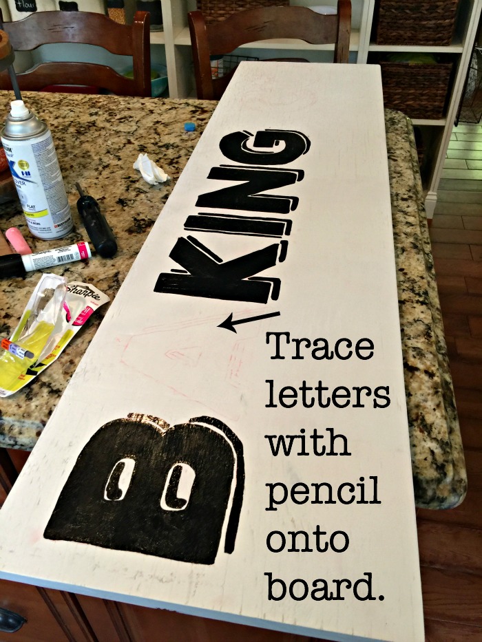
I then flipped the template over so that the chalk side of the template was on the front side of the painted board. Then I traced the letters using a pencil, making sure to apply enough pressure so the chalk transfers to the painted wood. You can see in the picture above how the red chalk leaves an outline that you can then paint in with a paint pen or paint brush. I used an oil-based black Sharpie paint pen to fill in the letters. I needed to use 3 of the pens to create this sign.
5. Hang New Sign & Decide It Needs Something More
Billy hung the sign for me (in between finishing up our new wall planking) and it just didn't feel finished to me. So we (meaning Billy) added a thin stained border around the sign as a frame. He cut & mitered the 1x2 strips and I stained them using English Chestnut by Minwax.
6. Hang Sign (Again) and Admire
Finally, thank husband for helping create a sign that adds so much to our newly revamped dining area for the price of 3 Sharpie paint pens.
I hope I have provided some inspiration for you to create your own sign. I have used the chalk technique to transfer graphics many times now and it is so helpful for non-artists like myself. I use it for most of my chalkboard art too. Here are a couple of more posts that I have discussed how I made signs using the same method.
Happy sign painting!




Yikes...you make it look so easy!
ReplyDeleteI shall be brave and give this a try-
Thank-you for sharing!
Yay! Give it a try, it really is that easy!!
DeleteI'm new to your blog Courtney, and I'm absolutely loving it! I've been surfing around, and your home is gorgeous! You're already giving me lots of inspiration! I love farmhouse style! Thanks for sharing!
ReplyDeleteSo glad to hear it, Nancie. Thank you for reading!!
DeleteBeautiful Courtney. It a perfect addition.
ReplyDeleteKris
Love your sign ! I went to picmonkey but did not no where to start. Any pointers?
ReplyDeleteThank you
Ali
Brilliant!! I never would have thought of this - pinning!!
ReplyDeleteCan I ask how you attached the frame cut wood to your sign? I've been meaning to try something similar, love the way it turned out!
ReplyDeleteCourtney, I love it. Your room looks charming. I think I will give Blockposters a try and I pinned your post so I won't forget details. You are such a clever girl!..xxo Judy
ReplyDeleteI love sign making, and your sign turned out beautifully! Wonderfully graphic and looks so good in the space!
ReplyDeleteYOU MADE THIS???? Holy AWESOME, Courtney!! I thought it was from maybe a local vendor or something..you're talented!! I use the chalk tip too. My BFA sister taught me it a few years back..genius right?! Happy weekend friend!!! #loveit
ReplyDeletePaige.Rose
from
www.TheQuaintSanctuary.blogspot.com
So pretty! I love the shiplap look, very farmhouse style.
ReplyDeleteLOVE LOVE LOVE! What thickness is the plywood? I have the perfect spot for a sign like this! :)
ReplyDeleteThank you So Much for the idea!! I just completed a sign for my entry and it looks great! I was going to buy this sign for $70 and ended up making it for under $10 because of you! Thanks :)
ReplyDeleteMaybe I’m just missing something but how does covering the entire back of the template with chalk only transfer the outlined letters? I’m confused can you explain
Delete